Popup and container size + mobile

Hello!

How can I increase the width of a pop-up window on PC version (I need more information in one screen without scrolling)
and
How can I increase the container of month calendar in mobile version it’s narrow compared to other elements of the site

2 Likes

Hi there, @Hnat_Kulish :waving_hand:

This code will help you change the width of the event popup on desktop:


@media(min-width:768px) {
  .global-styles,
  .eapp-events-calendar-modal-modalContent {
    flex-basis: 80%;
  }

  .global-styles,
  .eapp-events-calendar-popup-item-inner {
    max-width: none;
  }
}

And this code will help you remove side paddings on mobile and make the widget wider:

@media(max-width: 500px) {
  [class*="WidgetBackground__Wrapper-sc"] {
    padding-left: 0px !important;
    padding-right: 0px !important;
  }
}

Please add both codes to the Custom CSS field on the Style tab of your widget’s settings and let me know if they worked :slightly_smiling_face:

2 Likes

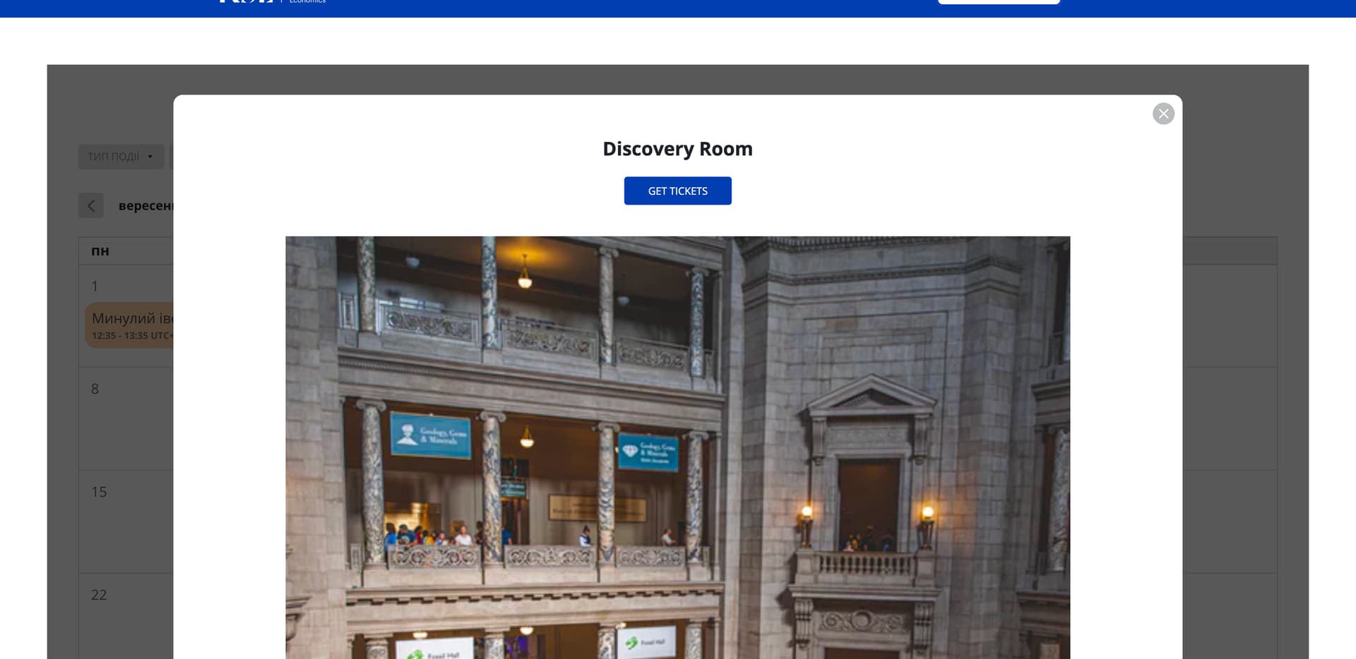
Thanks, much better. But the image takes up 90% of the pop-up screen on the PC. How can I reduce it, round its corners, and make it rectangular?
And
Is it possible to further expand the container or cells with dates in the mobile version so that the name fits into a maximum of two rows?
And
Is it possible to center the pop-up in the mobile version?
And
Move the button below to the description in both versions PC and mobile?

Thanks for your help!

2 Likes

Unfortunately, the only solution to display the long event names in 2 lines on mobile view is to reduce the font size using this CSS code:

@media screen and (max-width: 480px) {
    .fc-event-title {
      height: 22px;
      font-size: 8px !important;
      word-break: break-all;
      padding: 0;
    }
    
    .fc-event-time {
      font-size: 8px !important;
    }
    
    .fc-daygrid-event {
      white-space: normal;
    }
}

We already have a request to improve the mobile view for the Month layout and you can upvote this idea here - Mobile display for Monthly schedule style.

As for the ideas, I’ve forwarded your request to the devs and will inform you once I have any news :slightly_smiling_face:

2 Likes

Thanks
What about other questions?
Image takes up 90% of the pop-up screen on the PC. How can I reduce it, round its corners, and make it rectangular?
And
Is it possible to center the pop-up in the mobile version?
And
Move the button below to the description in both versions PC and mobile?

1 Like

Our devs are currently working on it! I’ll update you once I have their response :slightly_smiling_face:

Thank you for waiting!

Unfortunately, there is no way to move the button under description in the popup, but I’ve added this idea to the Wishlist on your behalf - Option to move button under description in popup

If this request gets more votes, it might be considered in the future :slightly_smiling_face:

And here is a CSS code to reduce the image height and make it rectangular, change image border radius and set the popup on mobile to the center:

.global-styles,
.eapp-events-calendar-media-image {
  border-radius: 20px;
  aspect-ratio: 2;
}

.global-styles,
.eapp-events-calendar-modal-mobile {
  margin-top: unset !important;
  margin-bottom: unset !important;
  align-self: center !important;
}

@media (max-width: 767px) {

  .global-styles,
  .eapp-events-calendar-popup-item-media {
    margin: 20px auto !important;
  }
}

Please try it out and let me know if you like the result :wink:

1 Like

Thanks for your help!

1 Like

You’re always welcome!

By the way, we’d like to invite you to participate in our September Contest, where you can win a 6-month extension for your subscription - September Contest: Best AI Feature Ideas Win 6 Months FREE!:wrapped_gift:

Check the details and join in :wink: