Does anyone know why the pin icons in Store Locator look like this. In my widget settings (elfsight) they look fine, but on the website they look like this. I have tried to change to other colors, regenerate the code, but nothing helps. It kind of mess up the user experience.
It looks like the style conflict that should be easily fixable by our devs. For us to check things, please send me a direct link to a page where the issue is present – we’ll take a look
Also, is there a way to reduce the height of the widget, to avoid too much scrolling? It would be nice to reduce by 50% as that would be enough to display 3 retailers and a big part of the map, and that will fit better into the web page, without having to scroll down.
Unfortunately, we can’t open this link, since it requires access to your website’s backend.
If your website isn’t live yet, could you please either add this widget to the test page of your website and share a link to it or provide us with the access to your website?
Once this done, we’ll gladly look into this with the devs
Just copied in the code to our LIVE website, and I can see that the map pins are displayed correctly on this site. For some reason they are not displayed correctly in our new template. Is that still something that sits within your development, or should I reach out to the new theme developers?
Does it make sense to you that pin icons are displayed in two different ways, in two different themes?
Yep, I got it! As Irene mentioned before, this issue occurs because of the conflicting styles. To fix it, we need to check the widget on the website with the theme, where this issue occurs.
If you could install the widget to the test page or share access to your website with us, we’d be happy to fix it and assist with the height customization
I have now installed the widget on the LIVE site. On the LIVE site the pins are fine, but the new theme I am working on does not display the pins correctly.
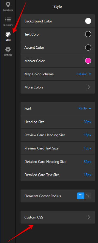
Thanks! To fix the marker color issue, please try to add this code to the Custom CSS field on the Style tab of your widget’s settings:
[class*="marker__Dot-sc"] {
    background: white !important;
}
In case it doesn’t help, we’ll need to check on the website with the theme, where the issue occurs.
As for the widget height, do you need to display only 3 locations in the sidebar without an option to see all the other locations when clicking on the Load More button?
The custom CSS code didn’t change anything from the pin perspective.
And, the map is still the same height, even with only 3 stores. Actually, the map is getting even higher and higher if I zoom out on the browser. It looks like a dynamic height that is not adjustable in any way, and the scrolling is unnecessary and bad for the UX.
I see that you’ve added the CSS code for the pin color to your website’s settings, but it should be added to the Custom CSS field on the Style tab of your widget’s settings:
As for the widget’s height, we’ll need to check it on the live page, where this issue occurs. Could you please either share a link to this page (if it’s already live) or install it to a test page, where the issue with the height is also replicated?