Max
September 18, 2025, 2:18pm
3
Greetings and welcome aboard, @Kris_the_Illusionist
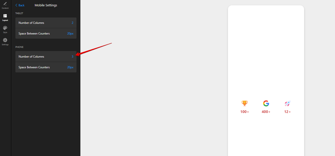
Glad to say that you can display all counters in 1 row using an option in the Mobile settings of the widget:
As for the vertical spacing, do you mean the padding between the icon and counter value?
1 Like
Hey Max! Thanks for the quick answer!
Yes, I meant on that, although I don’t need it anymore since it looks good to me at this moment when adjusted the content into row. And yes, my bad for that, I missed it somehow in the settings.
Thanks once again!
2 Likes
Max
September 18, 2025, 3:15pm
5
Great, you’re always welcome!
By the way, we’d like to invite you to participate in our September Contest, where you can win a 6-month extension for your subscription - September Contest: Best AI Feature Ideas Win 6 Months FREE!
Check the details and join in
2 Likes
Ah, going back to the topic
This would be cool to have as an option for the mobile view as well!
2 Likes
Max
September 18, 2025, 4:32pm
8
I’ll discuss if it’s possible to make the counter values look neat on mobile with 3 columns using this layout. I’ll report back once I have any news
1 Like
Thanks, I appreciate! I mean, I could do this with custom css, but it’s not so clean to select those “long” css classes
2 Likes
Max
September 19, 2025, 11:20am
10
Thank you for waiting!
Please add this code to the Custom CSS field on the Style tab of your widget’s settings and let me know if you like the result
@media (max-width: 480px) {
  [class*="GridProvider__Component-sc"] {
    flex-direction: row;
    overflow: visible;
  }

  [class*="Card__Component-sc"] {
    width: 30%;
    margin: 0 !important;
    margin-inline: auto !important;
  }

  [class*="Card__CardContent-sc"] {
    overflow: visible;
    position: relative;
    flex-direction: column;
    gap: 8px;
  }

  [class*="Counter__CounterComponent-sc"] {
    position: absolute;
    transform: translateY(-32px);
    top: 0;
    right: 0;
  }

  [class*="Main__Component-sc"] {
    overflow: visible;
  }
}
3 Likes

