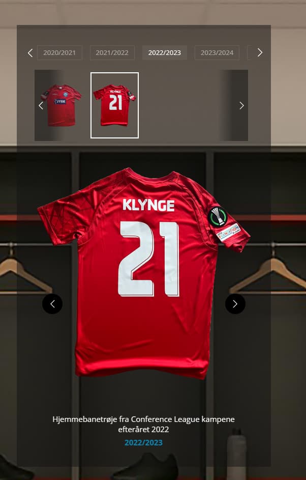
When description gets a line break(s), the additionnal lines do not push design downwards as usual and expected, but it pushes the image upwards, thus cutting off the top of this image.
This must be an oversight(?), as this makes it impossible to standardise images if there are a mix of short and long descriptions.
I’ve set this CSS to counter it somewhat:
.eapp-photo-gallery-thumbnails-image {
margin-top: 20px !important;
}
But this shouln’t be necessary. This makes it look okay on computers and tablets in Landscape orientation. But it’s impossible to make it work/look nice on Mobile/Portait orientation without having a huge gap. Try flicking through the season 2022/2023.
Thanks for sharing. I took a look. You’re right, it doesn’t look good.
But I did notice something with the padding.
If I deselect it, it works without the img margin.