Please can. you enable full control of mobile device settings for images, so image aspect ratio can display differently on a mobile device. Also control of side and top padding.
At minimum to be able to control this from CSS. At the moment CSS does nothing.
2 Likes
Hi there and welcome to the Community, @Boma_Garden_Centre 
Thanks for the idea! We’ll try to consider it as an option in the settings, especially if more users upvote it.
In the meantime, could you please specify the name of the Photo Gallery widget, where you’d like to apply these changes? Our devs will share CSS codes for your case 
1 Like
Hi Max, Thank you for your quick response and help. Here is the widget and the css we are trying to implement. I’ve included a screenshot of the gallery appearing on the mobile page of our website. Also, the css we are trying to use to maximise the thumbnail size. The CSS has zero impact.
/\* 0) Proof: does our CSS reach the Elfsight container? \*/ .elfsight-app-fee2d250-42ef-4276-a824-173d9b157cf1 { outline: 2px dashed magenta !important; width: 100% !important; max-width: none !important; margin: 0 !important; padding: 0 !important; } /\* 1) Mobile rules (only work if Elfsight does NOT isolate internals) \*/ @media (max-width: 768px) { /\* Kill common outer padding on GC wrappers near the widget \*/ .elfsight-app-fee2d250-42ef-4276-a824-173d9b157cf1, .elfsight-app-fee2d250-42ef-4276-a824-173d9b157cf1 \*\[class\*="container"\], .elfsight-app-fee2d250-42ef-4276-a824-173d9b157cf1 \*\[class\*="content"\], .elfsight-app-fee2d250-42ef-4276-a824-173d9b157cf1 \*\[class\*="block"\], .elfsight-app-fee2d250-42ef-4276-a824-173d9b157cf1 .row, .elfsight-app-fee2d250-42ef-4276-a824-173d9b157cf1 .section { padding-left: 0 !important; padding-right: 0 !important; margin-left: 0 !important; margin-right: 0 !important; width: 100% !important; max-width: none !important; } /\* Force full-width, large thumbs (if selectors are reachable) \*/ .eapps-gallery-grid, .eapps-gallery-slider { display: flex !important; flex-direction: column !important; gap: 16px !important; padding: 0 !important; margin: 0 !important; width: 100% !important; max-width: none !important; } .eapps-gallery-item, .eapps-gallery-grid-item, .eapps-gallery-slider-item { width: 100% !important; margin: 0 !important; aspect-ratio: 1 / 1 !important; /\* change to 4/3 if you prefer \*/ } .eapps-gallery-item img, .eapps-gallery-grid-item img, .eapps-gallery-slider-item img { width: 100% !important; height: 100% !important; object-fit: cover !important; border-radius: 8px !important; display: block !important; } .eapps-gallery-slider-arrow, .eapps-gallery-slider-dots { display: none !important; } }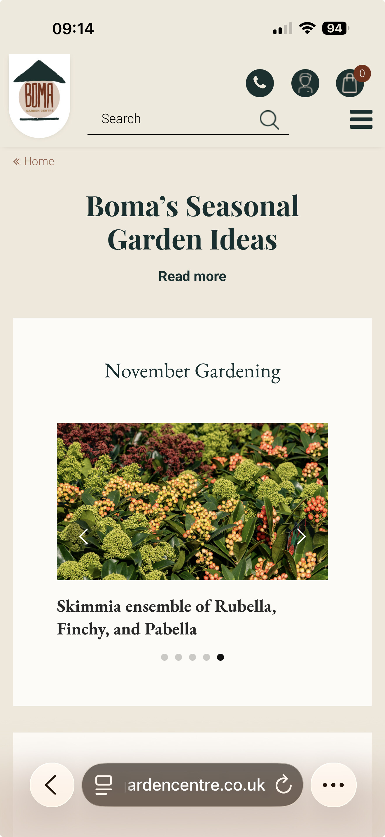
2 Likes
Hi there, @Boma_Garden_Centre
Thank you! Just to confirm before I pass your request to the devs. You need the following options:
-
change aspect ratio on mobile
-
change side and top/bottom paddings inside the widget container on mobile
-
change size of thumbnails (desktop and mobile)
Is that the full list of codes you’d like to have or more options are needed?
1 Like