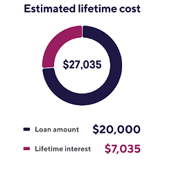
Enable the calculator to present information as a graph.
Hi there @Rob_Gepp and welcome aboard ![]()
Great thought! Let’s see if it catches on with the community ![]()
Great idea, thanks for sharing, @user14082! And welcome to the community, we’re happy to have you with us ![]()
Alongside the calculator results, it would great if it can also generate visual results such as line or bar graphs
Happy to see you on our forum ! Welcome, @user913 ![]()
This idea is already on the Wishlist. I’ve moved your comment to the related discussion, where we’ll keep you updated ![]()
I’d love it if the calculators produced a graph.
Appreciate it may not work for all calculators but most would benefit
Hi there, @Carl_Jones ![]()
Thanks for sharing your thoughts!
We already have this idea on the Wishlist. I’ve moved your comment to the related thread, where we’ll keep you in the loop ![]()
I would like a graph to accompany the results of our finance calculators.
Something like this: https://www.investor.gov/financial-tools-calculators/calculators/compound-interest-calculator
Greetings and welcome aboard, @Trevor_Danner ![]()
Thank you for the feedback and sharing an example - that’s much appreciated!
We already have a similar idea on the Wishlist. I’ve moved your comment to the thread, where we’ll keep you updated ![]()
Hi there, @Jeff_Tucker ![]()
Glad to say that we already have this idea on the Wishlist. I’ve moved your comment to the related thread, where we’ll keep you updated ![]()

