Hi! Here is a snippet of CSS code I’m using to make the chatbot window smaller on Mobile View instead of the default full-page view, and positioned towards the bottom-right where my icon is, with 40px border radius (rounded corners):
 @media screen and (max-width: 768px) {
    .es-window-container {
        width: 80vw !important;
        height: 78vh !important;
        max-width: none !important;
        max-height: none !important;
        position: fixed !important;
        bottom: 135px !important;  /* 135px from the bottom */
        right: 0px !important;     /* 0px from the right */
        left: auto !important;     /* Override left positioning */
        top: auto !important;      /* Override top positioning */
        border-radius: 40px !important; /* Rounded corners */
        overflow: hidden !important; /* Prevents content from overflowing */
    }
}
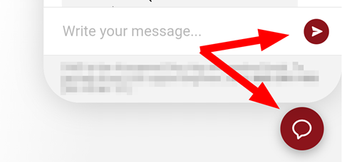
PeterC’s custom CSS works great, but in the smaller window, the Enter (arrow) and New Chat (bubble) buttons are so close it’s easy to hit New Chat by mistake and end the session.
Has anyone found a good workaround to add more space between them?
We tested the combined CSS (with both the 768px and 500px media width styles) on a mobile phone with 411px portrait, 915px landscape.
We encountered the issue shown below: the text entry box becomes unusably short after rotating to landscape.
The default chatbot behavior without the custom CSS works OK, so this isn’t urgent—just something we’d appreciate your suggestions on when time allows.
I don’t have a solution but thinking out loud-- after adding padding to the bottom, have you tried changing the height from 78vh to a larger number? And/or tried changing the top padding from ‘auto’ to a number?
Another thought is adding code specific for mobile view and tablet view. Something like:
@media (max-width: 767px) {
@media (min-width: 768px) and (max-width: 1024px) {
Max, that CSS did resize the chatbot window on mobile phones when rotating from portrait to landscape, but the result wasn’t usable—the input area was cut off, making it impossible to enter text on some mobile phones.
After some trial and error (and a helpful example from ChatGPT), we’re now testing the following CSS, which seems like an improvement:
.es-window-container[style='max-width: unset; max-height: unset;'] {
  width: min(320px, 90vw);
  max-height: 78vh;
  height: auto !important;
  border-radius: 16px;
  inset: auto 20px 100px auto;
  display: flex;
  flex-direction: column;
}

.es-window-container iframe {
  flex: 1 1 auto; /* Ensure iframe fills the space without overflow */
  min-height: 200px;
  max-height: 100%;
}

@media (orientation: landscape) and (max-height: 420px) {
  .es-window-container {
    bottom: 60px !important;
    max-height: 70vh !important;
    width: 90vw !important;
  }
}
With this CSS, on Android phones in landscape mode (which is rarely used by our visitors), the Gboard keyboard covers the input area, making text entry difficult—but rotating back to portrait mode makes the input area visible again. This still seems better than the default window sizing without this added CSS.
We’d be grateful if others could test this and share any suggestions.
Note: After applying this CSS, we edited our Footer Text in the “< >” Code Editor to include HTML non-breaking spaces ( ) and non-breaking hyphens (‑), so our phone number and business hours don’t break across lines in smaller windows.
