Avatars need to be on the Google Reviews badge (optional) so we have the flyout functionality with avatars — at the top of the funnel.
Hi there, @user32244 ![]()
I see that currently you’re using the Review Request Badge layout, where the avatars are displayed, but the badge doesn’t open a floating review panel on click.
You’d like to a badge layout that opens the floating review pane, but the avatars should be displayed on the badge, am I right? If so, which Badge layout would you prefer for this: Card Badge, Compact Badge or Reviews Button?

Hey Max
You get it ![]()
I just wrote this to your team for added context.
The point is that the widget (Review Request) links off-site to leave a review. Not what you want when someone has just landed on your page for the first time. They need to read reviews, not write one.
To answer your question;
Card Badge looks the best fit to me.
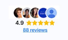
Everything is already built into that widget. Just need to change platform icons for customer photos/avatars. Something like this;
I forgot the ‘label’, but that’s a nice feature also.
Your flyout reviews are a great feature. We need that link (with photos) for hero sections. I think your user base will love it also, it’s so common now.
Even better with the Elfsight flyout functionality.
Got it, thanks!
This is a nice idea and I’ve moved it to the Wishlist. If more users support this request, we’ll try to think it over in the future updates ![]()