We don’t want the widget to be viewed left to right on mobile. Rather we want it to be viewed how it is viewed on the desktop.
Greetings, @Isaac 
Nice idea, thanks for sharing! We’ll have it in mind and see for more feedback from the Community 
YES PLEASE! At the very least some sort of indicator that the viewer needs to scroll to the side to see more…the way it is with only one event frame on screen there’s not really any visual cue that there’s more to the timeline.
Hi there, @JWD
Thanks for pointing us in this direction! Could you please describe your vision of such an indicator? Something like an arrow below the widget with the label “Swipe to see more”?
Hi! I also would really love for it to function the same way as on the desktop version, scrolling top to bottom. Hope this will come soon, thanks in advance!
Hey there, @user8566 and welcome aboard
Thanks for upvoting the idea! We’ll try to think about this layout option in the future, especially if more users upvote it
I agree; it’s not clear on mobile for the user that they need to scroll.
Hi there and welcome to the Community, @user24570 
Thanks for the feedback!
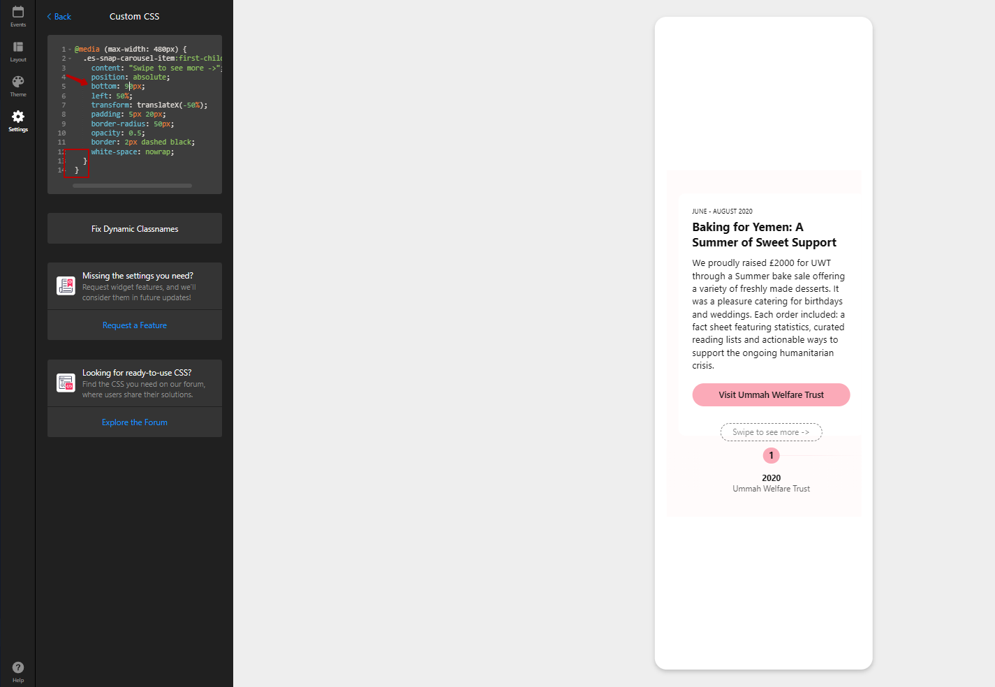
It’s possible to create a custom caption showing that you should swipe to see more events. Here is an example:

To achieve this, please use this code in the Custom CSS field on the Settings tab of your widget’s settings:
@media (max-width: 480px) {
  .es-snap-carousel-item:first-child:after {
    content: "Swipe to see more ->";
    position: absolute;
    bottom: 10px;
    left: 50%;
    transform: translateX(-50%);
    padding: 5px 20px;
    border-radius: 50px;
    opacity: 0.5;
    border: 2px dashed black;
    white-space: nowrap;
  }
}
If you’d like this caption to look differently, please describe your vision. We’ll be happy to adjust the code for you
Sorry I missed this reply… yes, that’s what I had in mind. Something simple and not too intrusive, but that would clearly show the action needed to get the full picture. Thanks!
Hi Max, this code doesn’t seem to be updating on my widget? Completely agree with the points mentioned above. There’s a great variety for desktop viewing which is fantastic but the mobile version is limited to just one standard option or the stories which doesn’t work well for everyone. It is very confusing to our current website users, as they’re missing key information given it’s hidden with no prompt or arrow to suggest they must swipe. Would love for this to be improved as it is one of our favourite and most used widgets! 
Hi there, @user3434 and welcome to the Community
Thanks for sharing your thoughts with us!
I cannot but agree that the vertical layout for the mobile view would help many users. Hopefully, the devs will be able to consider it in the future, and I’ll make sure to update you in case of any changes.
Regarding the code, you’ve missed the brackets at the end of the code. I’ve added them to your widget and changed the bottom value, so that the custom arrow wouldn’t cover marker title and text
Completely agree with the others who have requested this. The timeline is a great widget, but it must be responsive, and offer a mobile-friendly vertical layout, in order for us to be able to use it. At the moment, it protrudes out of the side of the webpage when the width of the page is reduced, making the page look broken - so, until this feature is added, we are unable to use it.
Thanks,
Luke
Hi there, @user611!
Thank you so much for upvoting the idea! We’ll keep that in mind and update you as soon as any news comes up.
As for the issue with the website width, please send me a link to the page, where your widget is installed. I’ll gladly look into this for you
Hi! Just adding to this, we’d love the vertical menu to be on the mobile version too. Currently really struggling to get the mobile version neat and compatible enough to use. Any pointers of workarounds would be great until the app is updated 
Thank you!
Hey there, @user4022 
Thanks a bunch for supporting the idea!
Unfortunately, we don’t have any workarounds to implement the vertical mobile view. However, if anything changes, we’ll immediately inform you here 
Yes, I would like to see a vertical layout option on mobile devices as well. This would be a nice feature for users to swipe as opposed to scrolling horizontally.
Thanks for upvoting the idea and welcome to the Community, @user32514 
Hi,
Please could you help me with inputting this indicator into my plugin? I just need it to sit underneath the icons and text neatly. ideally without the dashed line, Thank you:
Hi there, @Abigail_Greenwood
Sure, here is the adjusted CSS code for your widget
@media (max-width: 480px) {
  .es-snap-carousel-item:first-child {
    align-items: center;
  }

  .es-snap-carousel-item:first-child:after {
    display: block;
    content: "Swipe to see more ->";
    width: fit-content;
    padding: 5px 20px;
    border-radius: 50px;
    opacity: 0.5;
    border: 2px solid black;
    white-space: nowrap;
    margin-top: 20px;
  }
}