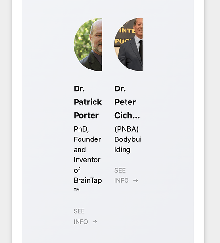
Hi it would be great to be able to view multiple post at once on the mobile view rather than one by one while scrolling to create better viewing efficiency.
Hi @Jasmine_Gilliam, thanks for sharing your idea!
Just to clarify, you’d want to control a number of posts displayed in the mobile views, correct? ![]()
Hi there, @Jasmine_Gilliam ![]()
If you’d like to increase the number of columns on mobile, please specify the number of columns you’d like to have. We’ll try to find a solution for you ![]()
yes
I’m thinking 3 columns, thank you so much
Got it, thanks!
Unfortunately, there is no way to display more than 2 columns on mobile. If 2 columns work for your case too, please use this code in the Custom CSS field ![]()
.eapp-team-showcase-grid-item {
  max-width: 25%;
}

.eapp-team-showcase-member-card-info-component {
  max-width: 100%;
}

@media (max-width: 700px) {
  .eapp-team-showcase-grid-item {
    max-width: 50%;
  }
}
Thanks! This is much better.
Great, you’re welcome ![]()
Hi there, @OHS_Graphics ![]()
This code should work great for you:
.eapp-team-showcase-grid-item {
  max-width: 25%;
}

.eapp-team-showcase-member-card-info-component {
  max-width: 100%;
}

@media (max-width: 700px) {
  [class*="WidgetBackground__Wrapper-sc"] {
    padding: 27px 10px !important;
  }

  .eapp-team-showcase-grid-item {
    max-width: 50%;
  }
}
Please try it out and let me know if it helped ![]()
It’s perfect! Thank you!!
It’s my pleasure!
In the meantime, we’d like to invite you to participate in our Birthday Contest, where you can win a 12-month extension for your subscription - Birthday Contest: 10 Winners, 10 Free Years with Elfsight! ![]()
Check the details and join in ![]()
