Hello! I just noticed my slide titles are wrapping when I scale my screen. Is there a way to prevent this and maybe have the text scale to stay within the line/container?

Hi there, @Lily_Gamble 
I’ve checked your widget and couldn’t replicate this behavior on my end. Does the issue occur when you use a browser zoom option?
Or did you mean changing the width of the browser window?
I appreciate you looking into it! It’s whenever I change the width of the desktop browser.
Thank you!
Please try to use this CSS code and let me know how it worked:
.eapp-slider-title-component {
  word-break: normal !important;
  overflow-wrap: normal !important;
  white-space: normal !important;
}
That doesn’t seem to have worked.
The code was added to the wrong place, but we’ve adjusted its placement. Please check it out and let me know if it helped 

We’ve adjusted the position of the slide title using this code:
@media (min-width: 640px) {
  [aria-label="Slide 5"] .eapp-slider-title-component {
    margin-bottom: 100px;
  }
}
Please let me know how it worked
I don’t believe that worked. It’s also an issue on the second slide (so if you figure it out, it can apply to both slides!).
Do you see this issue only on your website or in the widget configurator too? If the issue is reproduced on the website only, please send me a link to the page where your widget is installed.
Also please specify your device and its screen resolution 
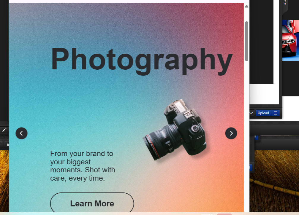
If the placement of the top line of text is not critical, it seems like applying a margin-bottom or line-height would help. If the placement is critical, I would try using a different color text for that line with maybe 20% transparency - at least the overlap wouldn’t be black on black. Another option might be to apply CSS clamp sizing to the ‘Videography’ element, which would make the text appropriately sized for any screen size.
Here is the website I’m seeing the issue on: https://lilykgamble.com/. I’m currently working on a MacBook Pro 14"!

I’m not a fan of how that looks. I think I’ll play around with the layout options and see if that helps with how the elements interact with each other on different screen sizes. I appreciate all of your help!
Hi there, @Lily_Gamble
I’ve reached out to you in a personal message. Please check it out