@Max It works but you can see the text on the last line not perfectly aligned to the middle horizontally. Can you look into this please?

2 Likes
The thing is that this was a code for your Technical & On Page SEO widget, where this code was also used:
.es-column-padding-block {
  display: none;
}
To make it work in the Local SEO widget, you should also use this code in combination with the code I’ve shared in the previous message:
.es-column-element {
  margin-bottom: 0;
}

.es-column-padding-block {
  display: none;
}
Check it out and let me know if it helped 
2 Likes
@Max I can’t see text on mobile and hint option look weird. Can you tell me the solution of this?

2 Likes
Could you please specify the name of the widget in question?
1 Like
@Max Price Comparison table. Also I don’t see the arrows on mobile to scroll
1 Like
@Max It’s urgent. Can you please help me on these issues?
2 Likes
I’ll try my best to help!
I’m checking things
2 Likes
Okay, thank you @Max I’m waiting
2 Likes
I’m not sure which specific widget is shown in your screenshot, as all of them start as Price Comparison Tables. However, I’ve identified an issue with the feature and hint text in the Price Comparison Table – Technical & On-Page SEO.
The text and hints are not visible because you’ve selected white as the text color for the Head Column:

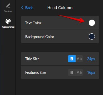
Since the Head Column can’t be displayed on mobile, the white text ends up on white backgrounds in the other columns, making it invisible.
To fix this, you can either change the text color for the Head Column, or set a specific color for the feature text on mobile using the following CSS:
@media (max-width: 500px) {
  .es-features-feature-text {
    color: black;
  }
}
The color of the hint icon is defined by the Secondary Color option:

To set a specific color of the feature hint on mobile, please use this CSS code:
@media (max-width: 500px) {
.es-features-feature-hint {
  color: red;
}
}
The issue with the arrow isn’t showing in the widget I checked, but the arrow color is also controlled by the Primary and Secondary Color options:
- Primary – controls the arrow background color
- Secondary – controls the arrow icon color

Here is the code to change the color of the arrow background and icon on mobile devices:
@media (max-width: 500px) {
.es-snap-carousel-arrow-control {
  background-color: green;
}
}

@media (max-width: 500px) {
.es-snap-carousel-arrow-control {
  fill: red;
}
}
Try it out and let me know if it helped
2 Likes
@Max But I didn’t see the arrows on mobile when I embed the widget on my website? Please help me with this too. User don’t know how to see the rest of the content without that. This is very important otherwise a big problem.
2 Likes
We haven’t added the arrows for the mobile view, as the widget shows one full column and a part of the next column. So, the website visitors see that there are more tables on the right and can swipe.
However, we kept them for the mobile view in the configurator, because you can’t use the swipe option when checking it from the desktop:

We agree that for more clarity it would be great to add navigation arrows too and this idea is already on the Wishlist - Display navigation arrows on mobile.
If more users upvote it, we’ll try to consider it in the future
1 Like
@Max Icon not aligning to the cell in middle horizontally on my website. Can you provide me with the code to fix this?

1 Like
@Max Kindly tell me the solution of above and also how I can reduce the text size for widget title in mobile view? Thank you!
1 Like
Hi there, @user2283 
Sure!
Align icons:
.es-features-container > :first-child {
  align-items: center;
}
Change title size on mobile:
@media (max-width: 500px) {
[class*="WidgetTitle__Header-sc"] {
  font-size: 20px;
}
}
Try it out and let me know if it helped
3 Likes
Thank you @Max Do I need to update the code after adding this code on widget or it dynamically update it on my website?
1 Like
@Max Also can you provide me with the code to align the icons in the rest of rows? Like I’ve another table which have 6 rows and have icons so what would be the code for that so in all rows it aligns perfectly. It works for first row only. Thank you
2 Likes
This code will align the icons in all rows:
.es-features-container > div {
  align-items: center;
}
Please check it out!
Once you add the code to the widget, you just should click publish in the widget editor and the changes will be reflected on your website
3 Likes
@Max It works. Thank you!
2 Likes
Awesome, you’re always welcome
1 Like
Hi @Max I want to add small images of different platforms here instead of text in place of Google Pay per Click, Local Service Ads etc . Can I do that? If yes, please let me know how. Thank you!

2 Likes